Intro. Why I am a Product Designer?
After working for a year in the Russian design studio as a UX/UI Designer, I figured out that providing a one-stop shop for several companies simultaneously means quality sacrificing. But the quality is super important for me and I can’t compromise my inner standards
That’s why I said “goodbye” to studio design and on the next day woke up as a Product Designer. The good fortune came my way and I met MK, who asked me to join Shopper.com startup and take part in creating its new product.
Problem
The new product of Shopper.com supposed to solve two problems:
- Help online shoppers save money.
- Make the business grow by increasing registrations and user adoption.
Challenge
- The challenge was to plot a course in ambiguity, handle covid-19 and achieve a high-quality implementation with the junior devs team.
- This project also challenged my commitment to become a Product Designer in the international team. So I worked hard to gather knowledge and acquire new skills to deliver the best product I can.
Solution
I widely promoted Alexander Osterwalder's methodology throughout the project to design the Value Proposition. Then I’ve used Design Thinking process to bring all pieces together. Eventually, we created a platform, where people can get the best prices with the help of community and discover inspiring shopping ideas.
The Process
Screener Survey
- The quality of CR has a huge impact on the final product. To run a good one—it's crucial to talk to the right people. Initially, we thought the “right people” are frequent online shoppers.
- But I thought, “frequent online shoppers” is a mix of different customer segments, and researching it will very likely lead to contradictory outputs which will be insane to operate from.”
- To avoid that, I suggested to research shoppers with money-saving issues right away.
Next, I created a form to get those people for interviews.
Interviews
- I prepared interview questions to find out how online shoppers get the best prices nowadays, and which problems they experience along the way.
- It turned out, shoppers leverage a good variety of technics to save money, such as adding items to bookmarks and wait for a discount, shopping in incognito mode, buying second hand stuff, cash-backs services, limiting budget, reward programs, etc.
However, price comparison and coupon codes grabbed our special attention…
I appreciate your time!
It’s very likely you went through many portfolios for today. To save your time, I share the final product right away. If you enjoy design process like me, read It!
Read Full Process ~9 minMy Two Beliefs
My two personal beliefs influenced a further product direction.
- Belief #1.
Every product must primarily solve a problem. And the more serious problem it solves, the more value it brings for customers and business. How to understand if the problem is serious enough? The answer is — if people are trying hard to solve it.
- Belief #2. Change people is difficult.
That's why the best way to make users adopt a new product is to build it on behaviour that is already familiar to them.
The majority of shoppers claimed over and over that the most effective ways to buy cheaper are price comparison and coupon codes. These behaviours came as natural for them. But at the same time, these activities were overloaded with problems shoppers actively try to solve.
“Isn't that interesting?” — I thought. It was a nice starting point for our product.
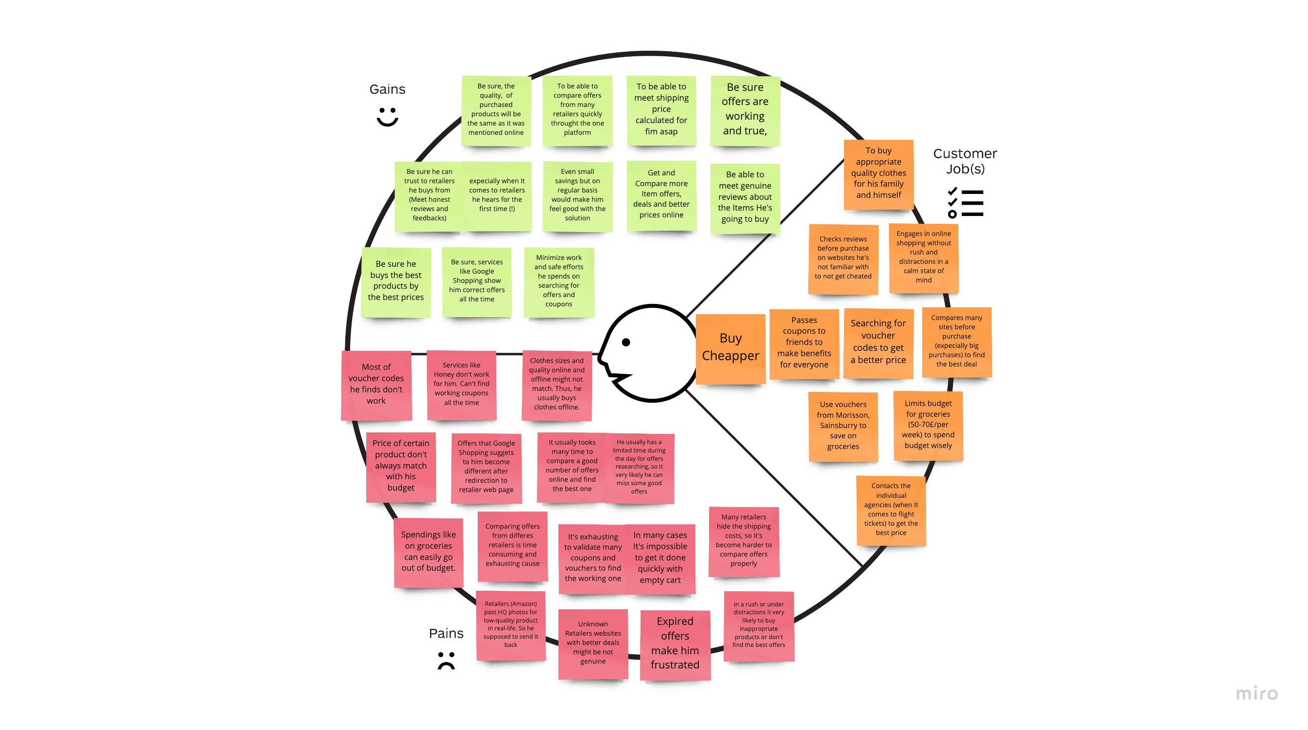
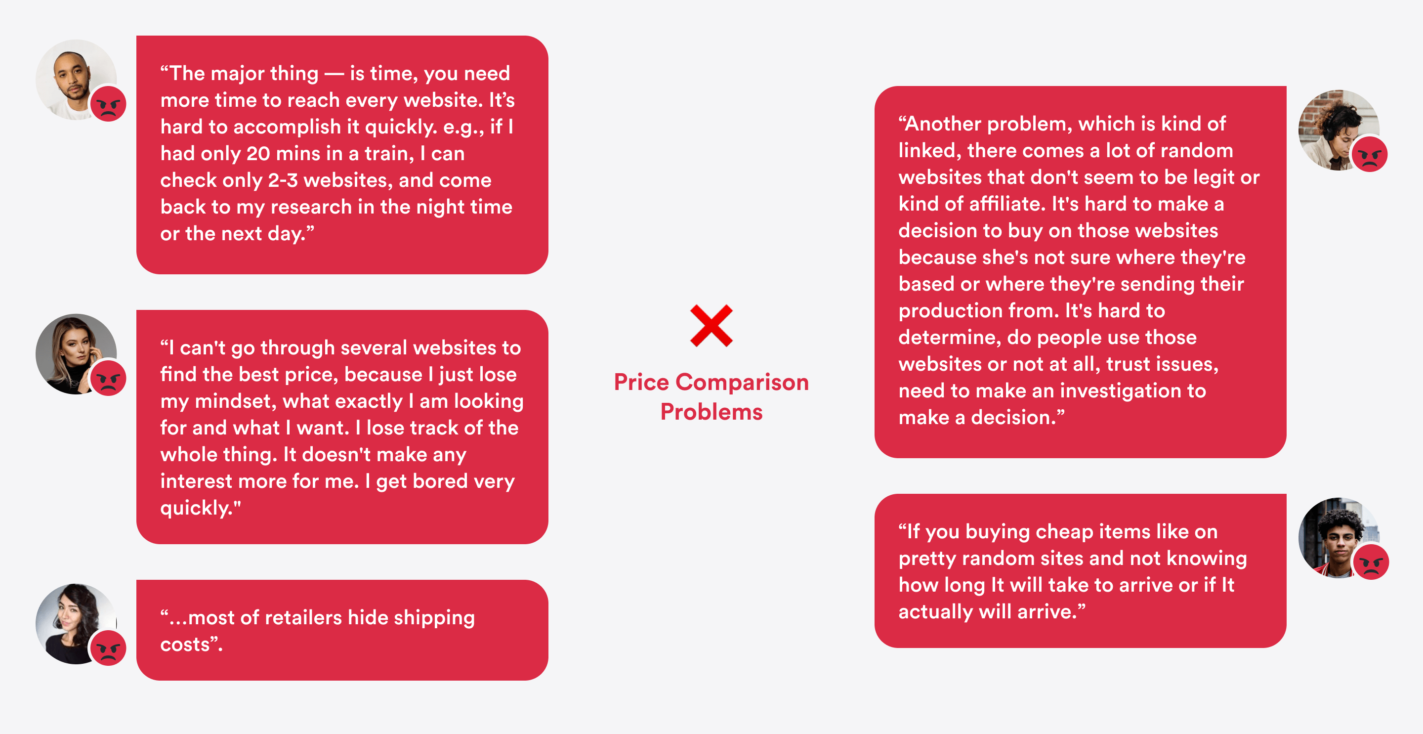
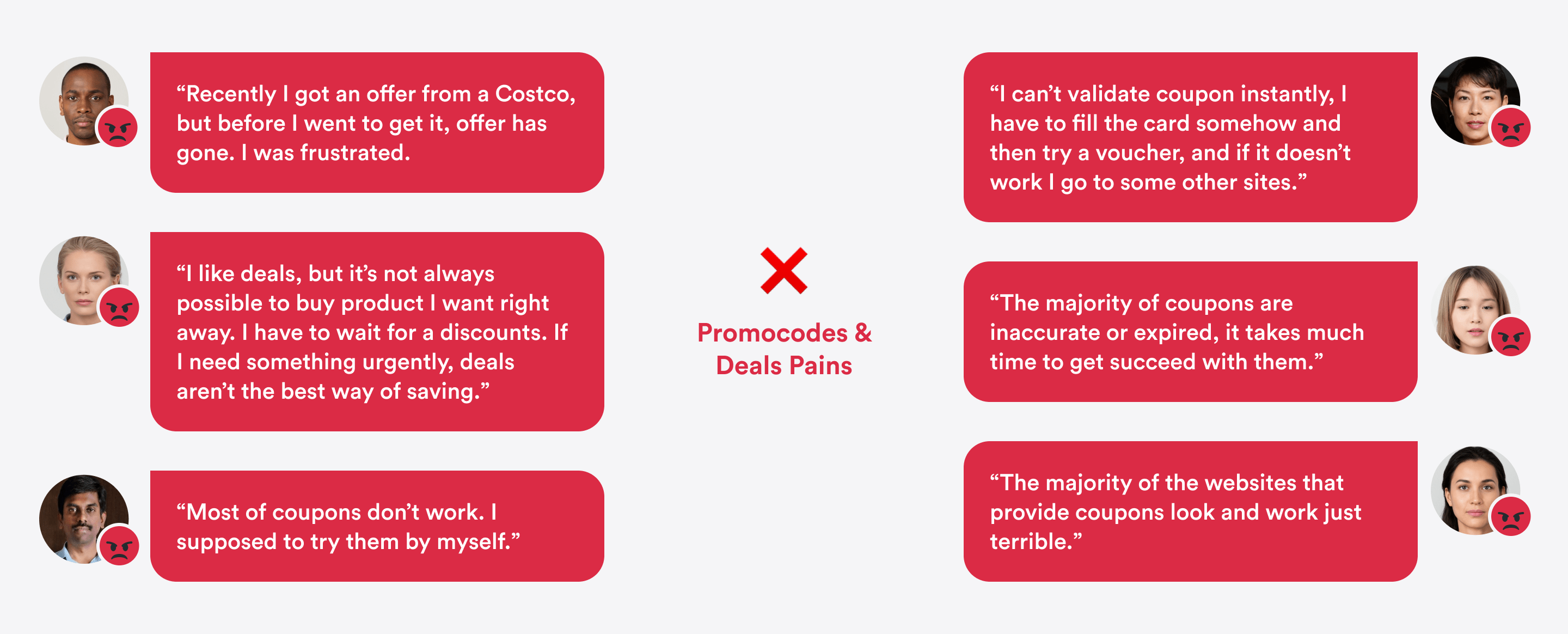
Pains & Insights
First of all, we took a closer look at why it’s so hard to compare prices and searching coupons:
Then, I've revealed insights
- Permanence is over Discount amount.
People prefer products that bring them small but regular savings, like $1 from every purchase, rather than rare discounts with high amount.
- Some people like sharing offers.
They get benefits and feel joy by helping others. One shopper claimed, he has a close network of friends where they share coupon codes, “So, everybody gets benefit”.
- Influencers are the best coupon providers.
We discovered, that shoppers who were most satisfied with coupons got them from by consuming influencers content.
Customer Profile Maps
To establish better empathy across the team, I mapped customers' jobs, pains, and gains.
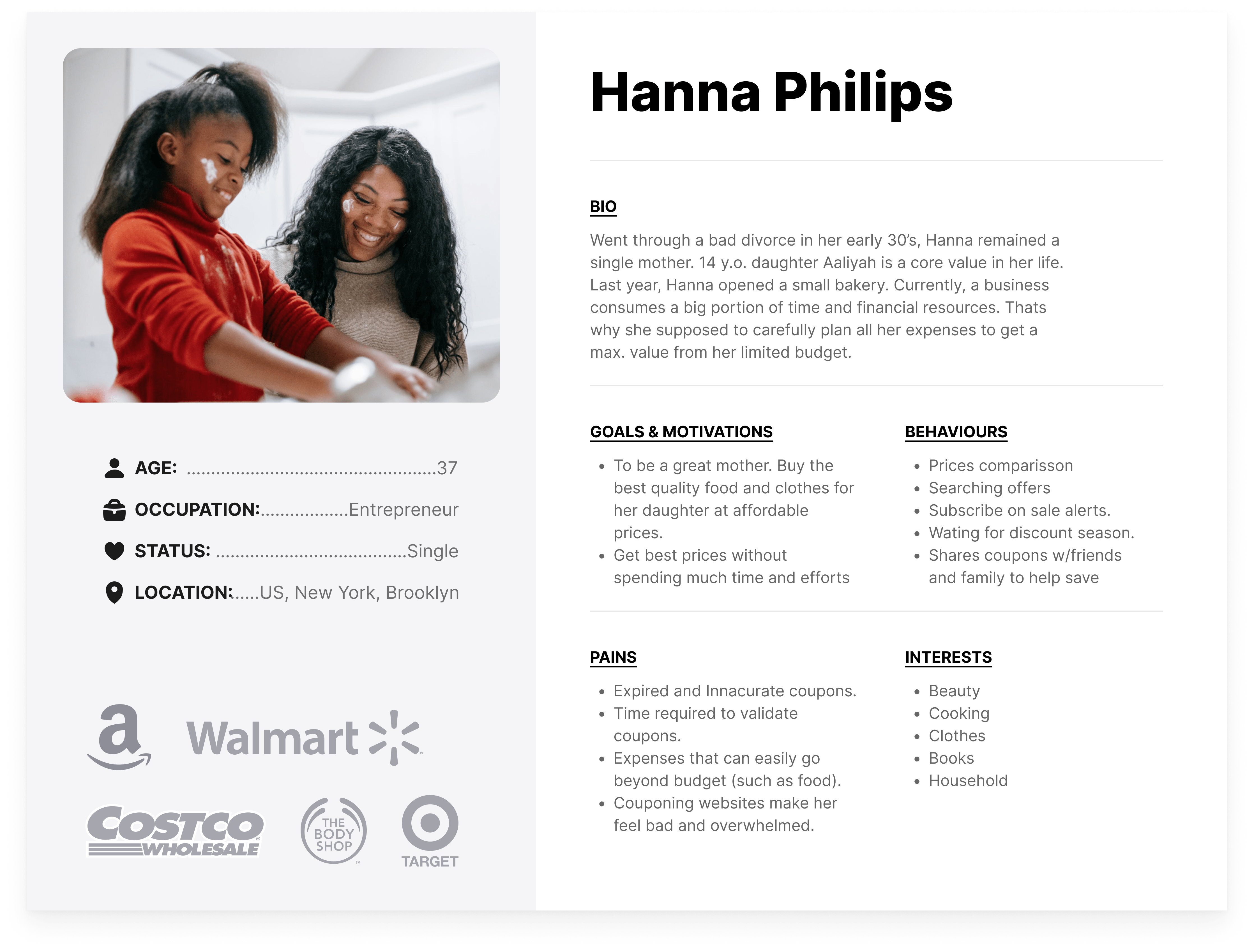
Persona
Problems are important. But what is even more important — human stories, that stand behind those problems. That's what really empathetic.
Brainstorm & Value Proposition Maps
Got inspired, we brainstormed ideas, broke them, negotiated, and ideated again.
I truly like ideation stage because of opportunity to think divergent in non-judgement environment and build on others ideas.
Finally, we came up with 3 preliminary Value Propositions: Price Comparison app, Shopping Reviews app, and Discounts Community.
Covid-19 and One Step from Bankruptcy
Landing Page test? “Buy Feature” test? “Speed Boat” test? — Unfortunately, no.
Covid-19 burst in like a hurricane and turned our project upside down.
- Do I quit?
Because of uncertainty of the future many investors have returned their investments and our startup was no exception. I still remember one serious morning call with PM. Because of the significant cutoff of our budget, I had to decide, stay in a company part-time or leave. In fact, it meant to work full-time for part-time pay or leave. “Having a part-time product designer — is like having a part-time spouse.“ — I thought. So I decided to stay and get this project done no matter what.
- Move fast.
We didn't have much time and resources to test all our hypotheses. Instead, we had to pick one direction and go all in. Next days, I’ve got a refined product strategy from my PM.
Product Strategy
According to a new plan, our product had to have two parts:
- Explore Page
From one side, our product must be a hub, where shoppers will share discount and collaborate to control accuracy and discover even better bargains.
- Profile Page
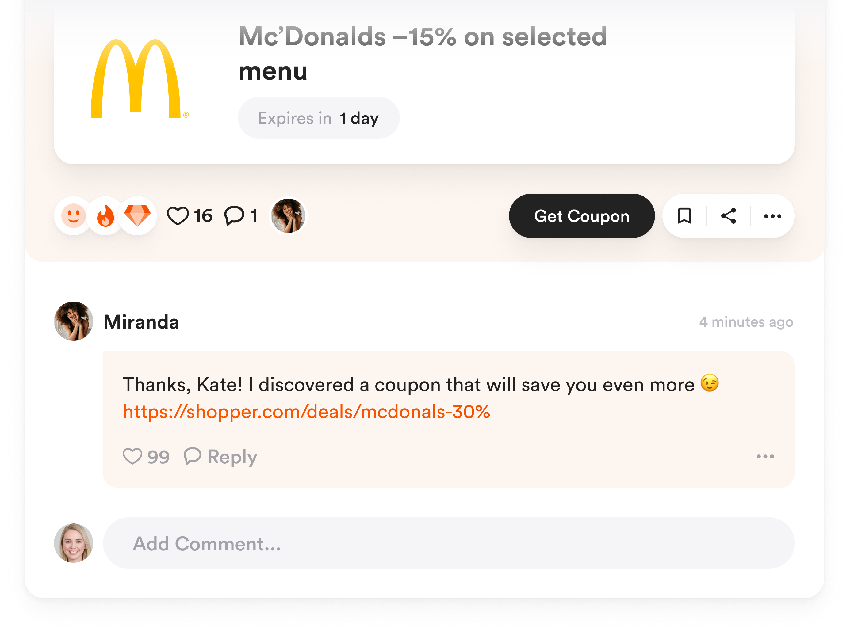
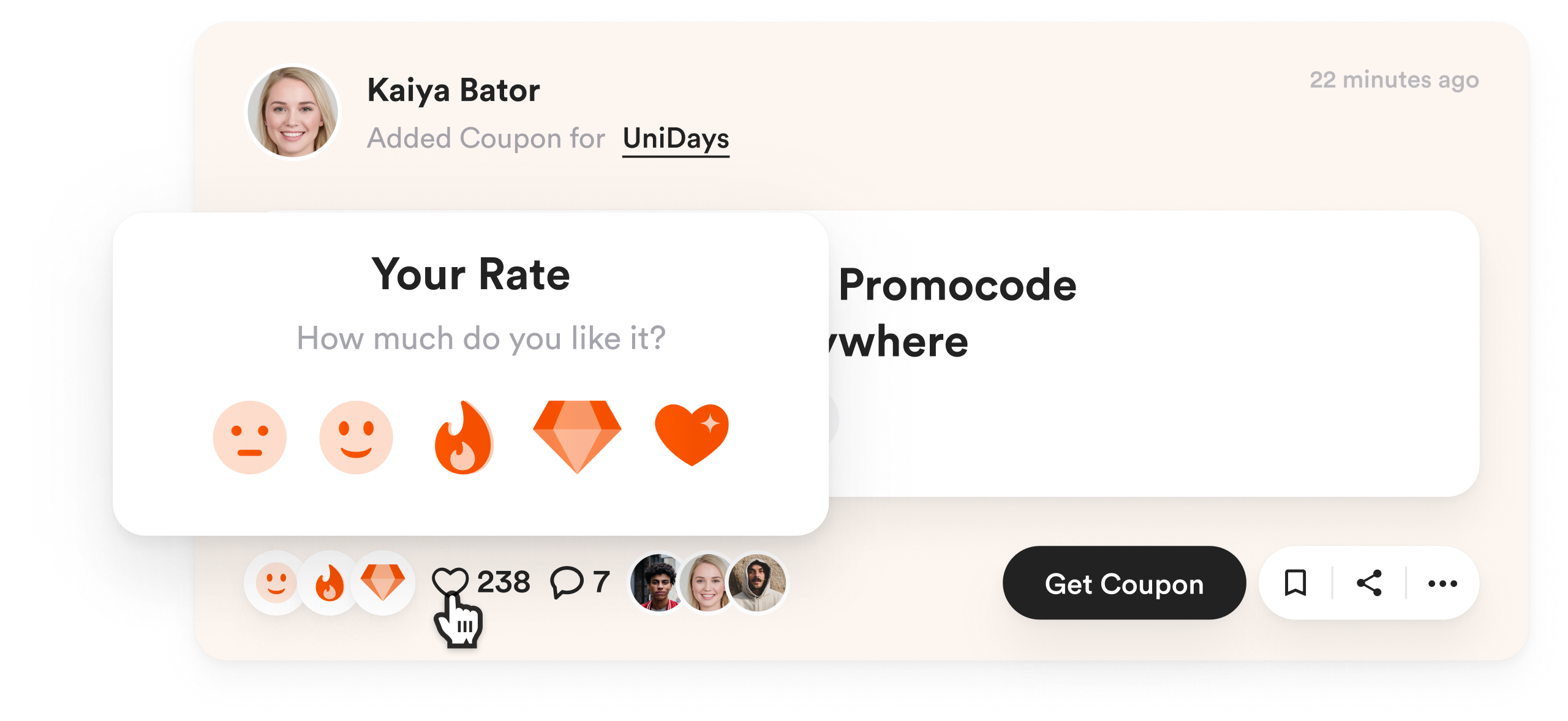
From the other side, our product supposed to be a tool for influencers to manage and share shopping recommendations with fans. Why influencers? Answer: To fill our platform with legendary coupons.
Overall, my PM’s plan sound like this: Products and coupons that influencers share will come into shoppers’ feed. Shoppers will get coupons and inspiring recommendations, while influencers will gain affiliate traffic and handy tool. Everybody wins!
UX. Step by Step.
- Flowcharts
I mapped all user tasks with flowcharts to ensure a seamless experience across the product and eliminate dead-ends.
- Sketches
I developed framework called “Blocks”. The idea is, when you design a new screen, you prepare in advance all content blocks that might be there. Then, you invite all product team to play a LEGO. So they can quickly build their variants from the blocks. It allowed us to make a decision, taking into account all opinions, and avoiding “I wasn’t asked” syndrome.
- Prototypes
Honestly, I never know in advance how the perfect solution looks like. Nobody knows. That's where Iterative Design works miracles. Every new iteration brings clarity. I love testing, learning and continuously improving. That's how amazing solutions born!
Visual Language
First of all I came up with 3 mood-boards to my Product Manager to discover a visual language we want:
One call, few corrections, and our visions got a match. We decided to use big white spaces, mild shadows and big controls to communicate the transparency and simplicity of use. The idea was to create an “AirBNB for coupons”. So it allowed us to be memorable and stand out from horrible couponing websites.
Design System
I believe that Design Systems is a great investment into the product development, what will definitely save tones of time and efforts in the future. And no matter it's a young start-up or a mature organisation. So I came up with a minimal one.
Development Quality Control
I handed off high-fidelity designs to devs and anticipated a product launch. But the first version I’ve got remained this:
Oops.
Unbroken, I've asked guys to make another version, following all margins, font sizes, and elements dimensions:
The quality of implementation means everything. If the implementation is bad, it doesn’t matter, how brilliant is your idea or how beautiful were layouts in Figma. — So, I decided it’s my responsibility to take it under control.
Soon, I ideated a set of technics to get it done:
- Communication
- Explanatory Tools
- Components Library
- Corrections List
The latest worked especially well. I’ve shared ~669 corrections to approach the pixel perfect implementation and clear logical transitions. Insane!
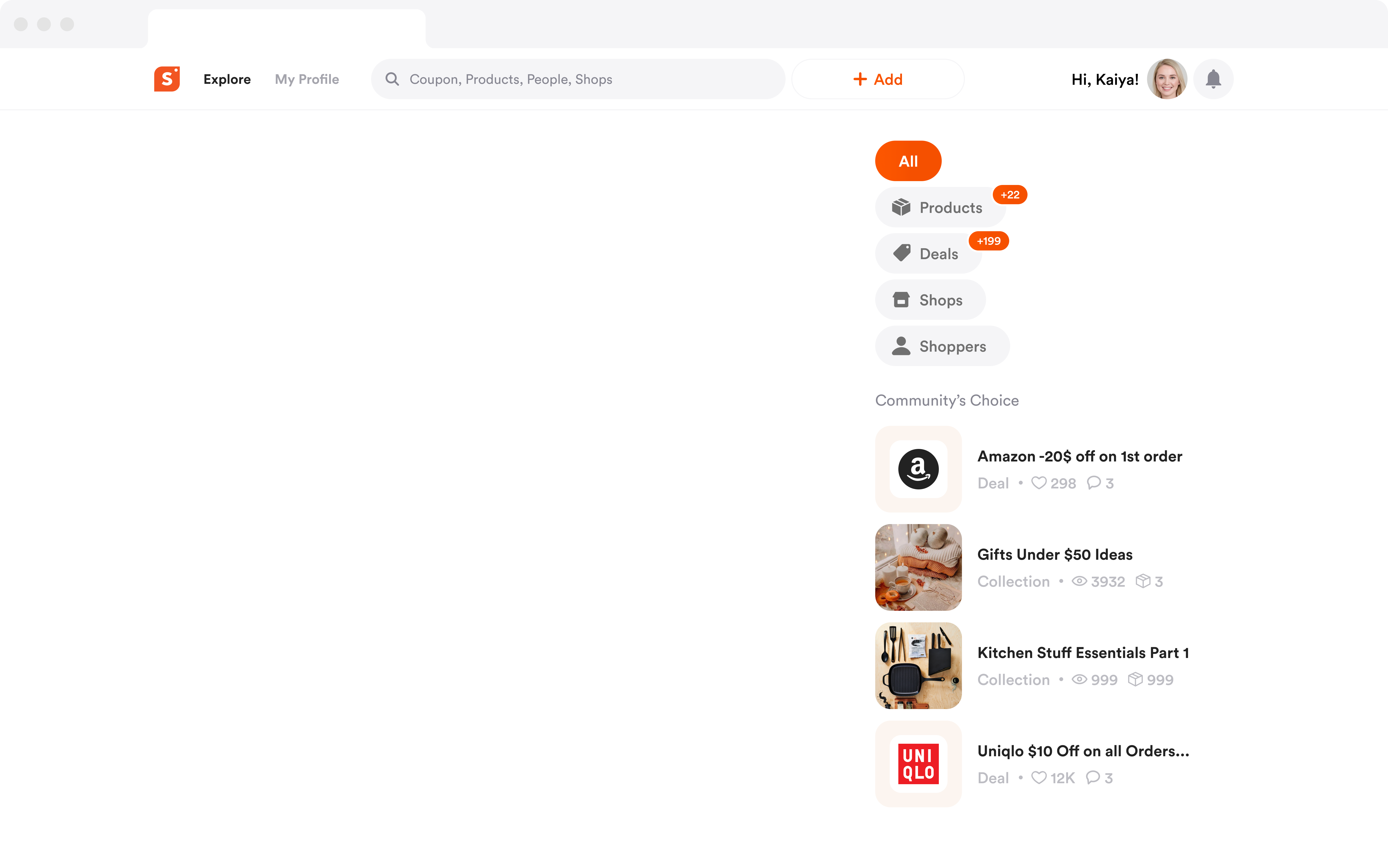
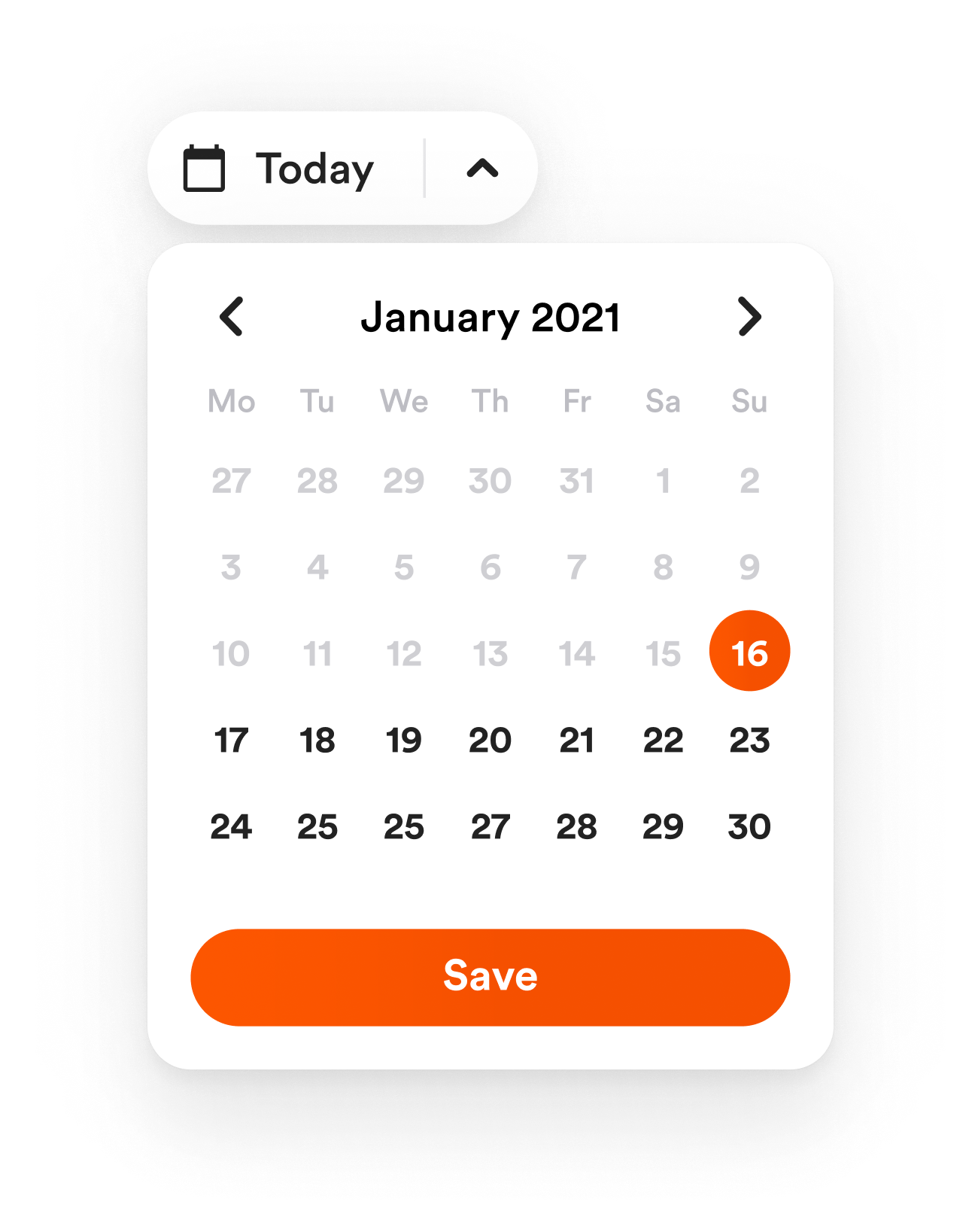
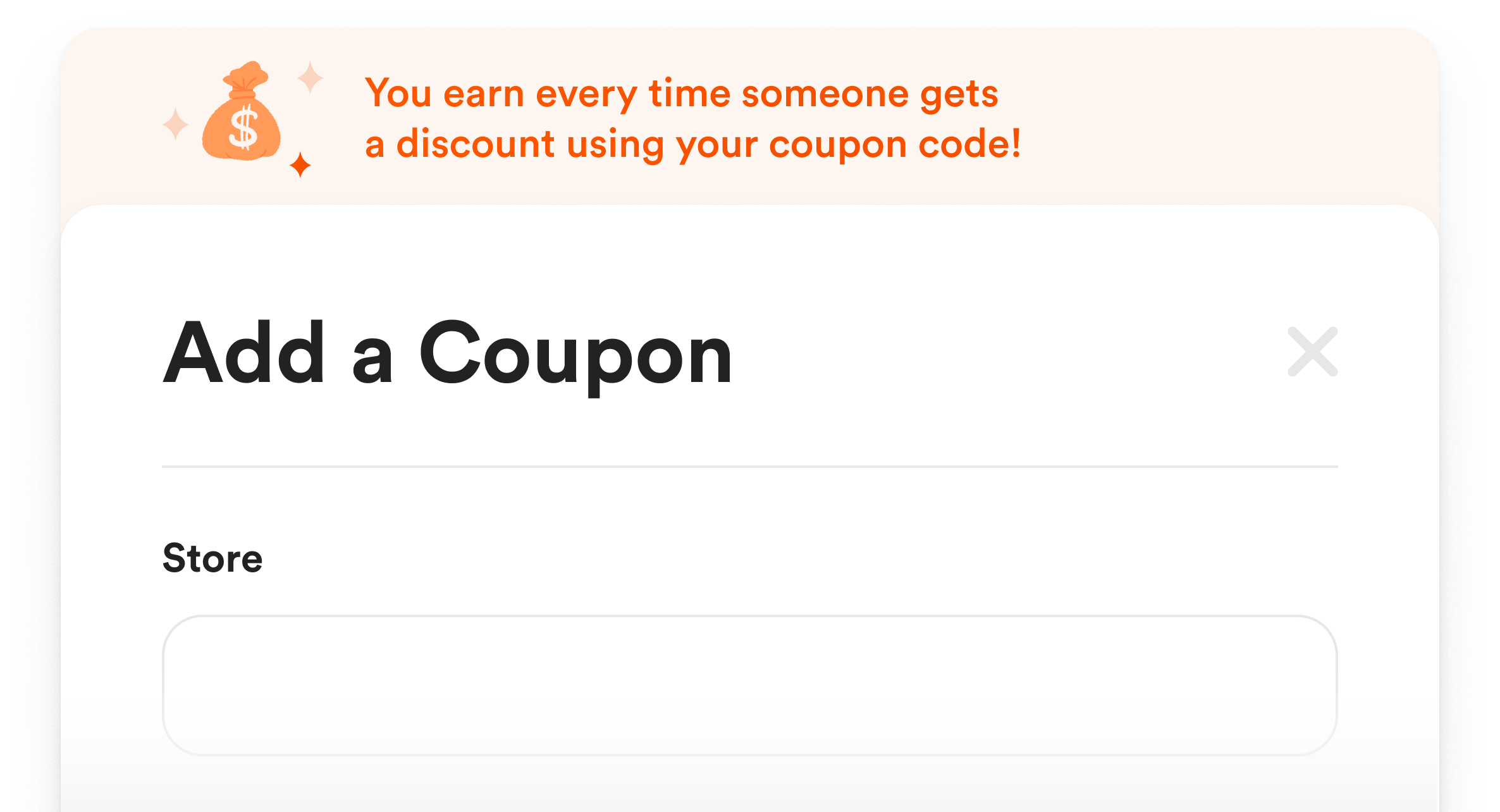
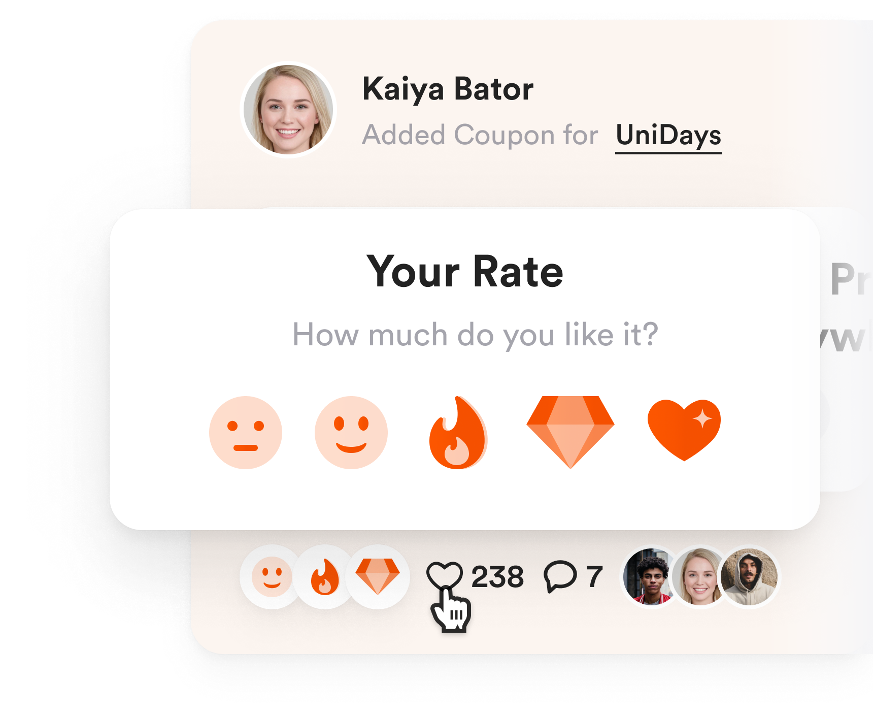
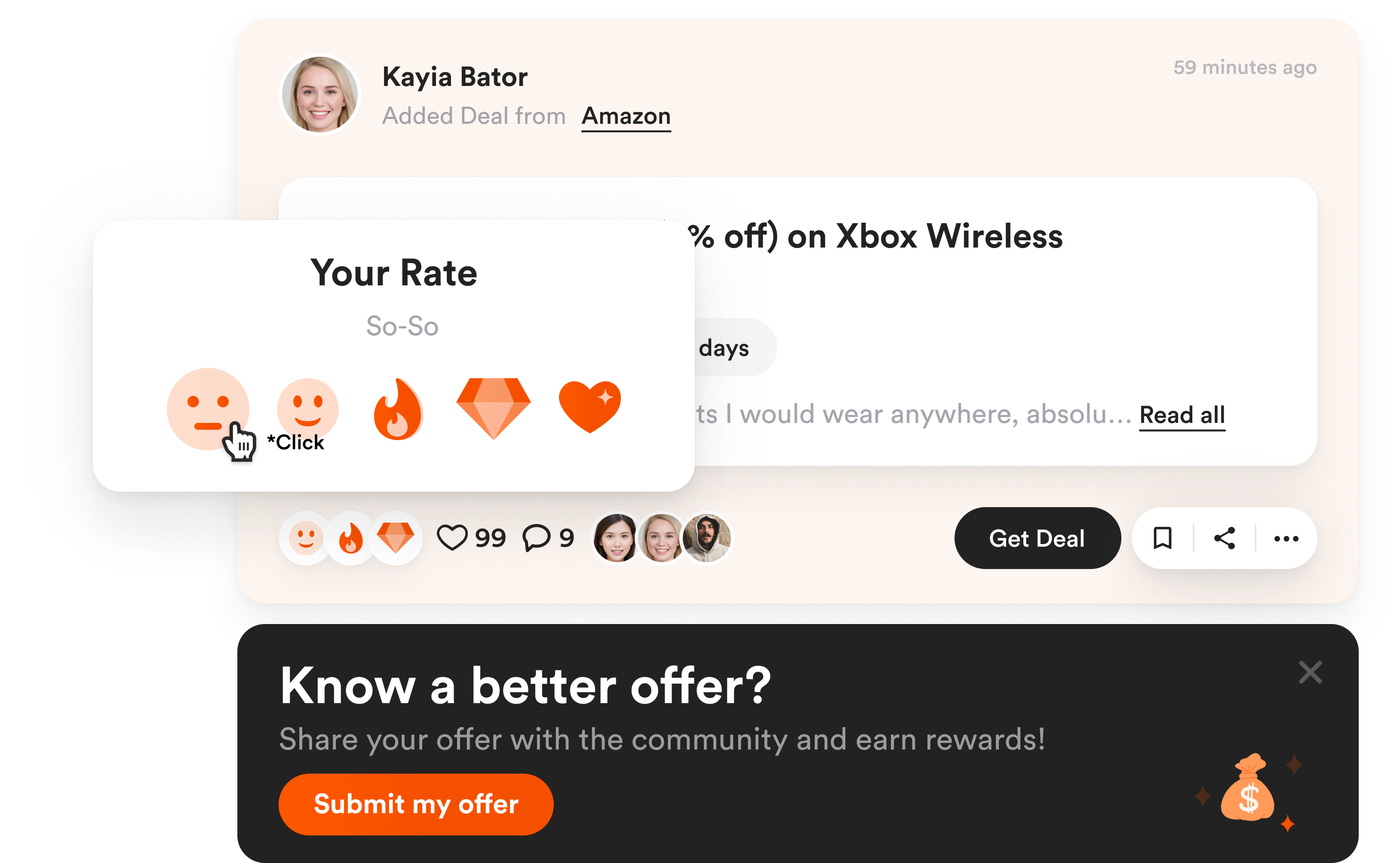
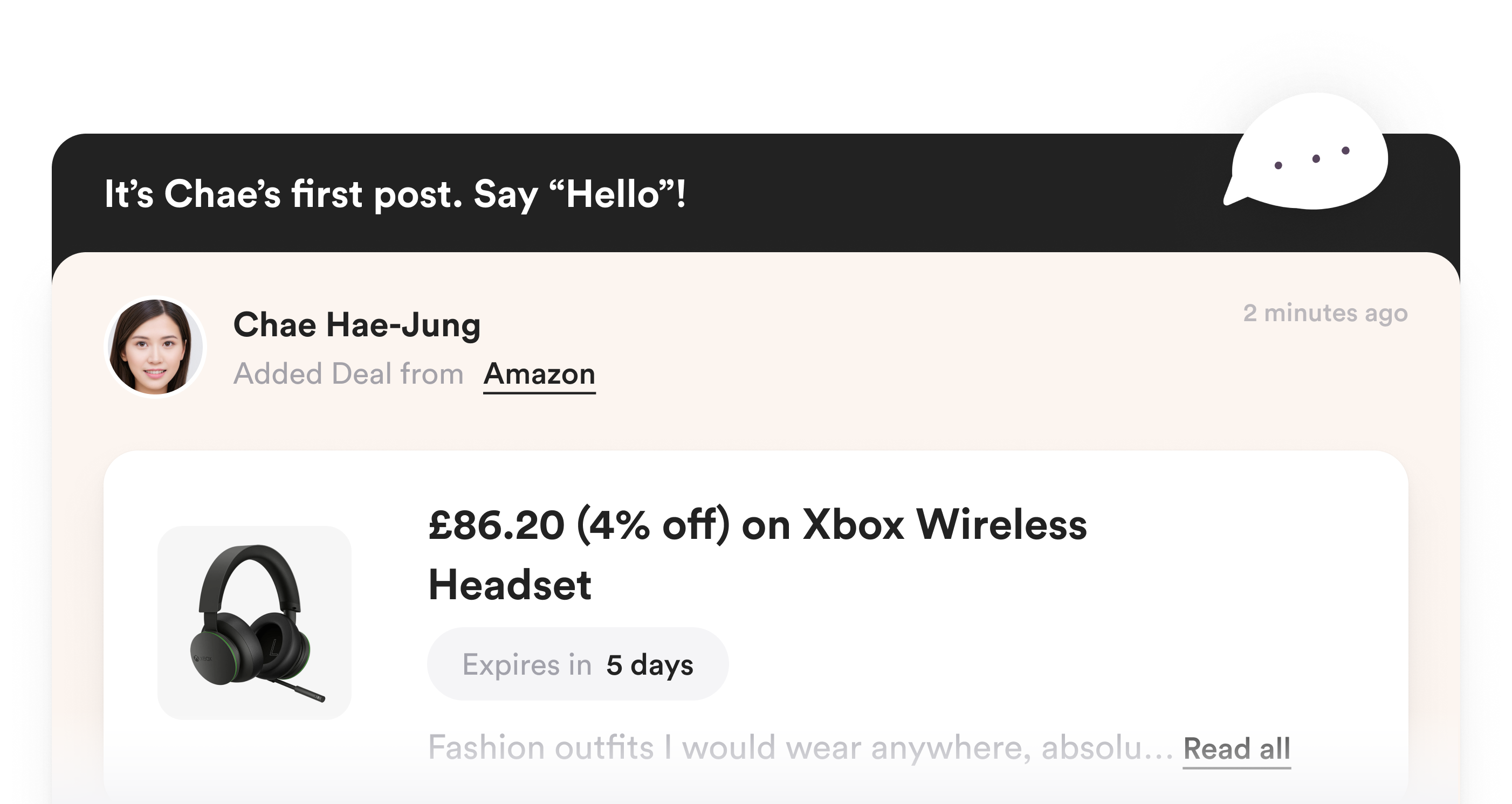
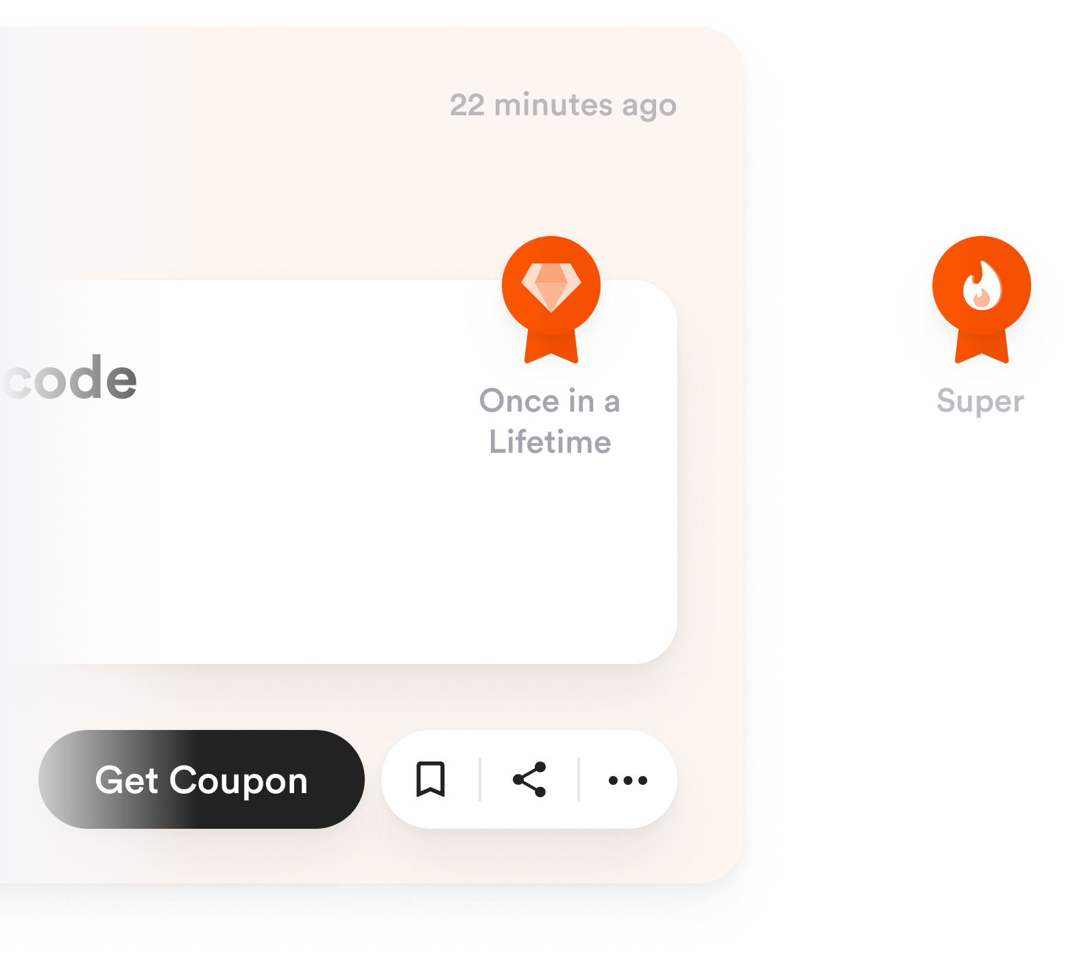
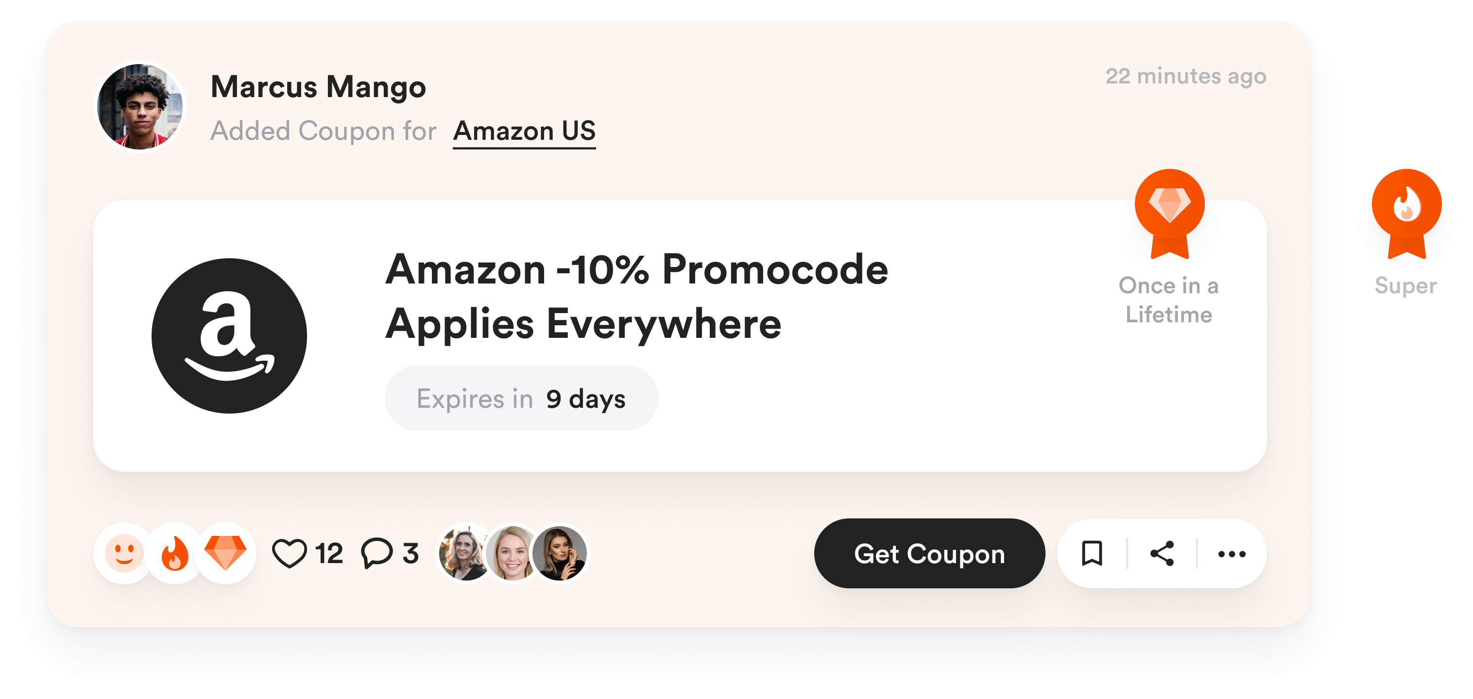
Final Product & Best Solutions
.jpg)


.png)
.png)